Bear markets can be split into three categories: Structural, Cyclical and Event-driven.
The initial transition from a bear market to a bull market tends to be strong and driven by valuation expansion, irrespective of the type of bear market.
But bear market rallies are common, making these transitions difficult to spot in real time.
Low valuations are a necessary, although not sufficient, condition for a market recovery. Getting close to the worst point in the economic cycle, reaching a peak in inflation and interest rates, and negative positioning are also important.
Our fundamentals-based Bull/Bear Indicator (GSBLBR) and our sentiment-based Risk Appetite Indicator (GSRAII) help identify potential inflection points. Combining these can provide powerful signals when they are both close to extremes.
We have not yet met these conditions, suggesting further bumpy markets before a decisive trough is established.
We expect the next bull market to be 'Fatter & Flatter' than the last; this 'Post-Modern Cycle' is also likely to be driven by some distinct themes with a greater focus on margin sustainability.
Summary
Lower aggregate returns; a Fat & Flat rather than a secular bull market.
More focus on Alpha than Beta.
A greater reward for diversification and buying at attractive valuations.
Investment to increase corporate efficiency (energy efficiency and labour productivity).
Bear market profiles
Structural bear market - triggered by structural imbalances and financial bubbles. Very often there is a 'price' shock such as deflation and a banking crisis that follows.
Cyclical bear markets - typically triggered by rising interest rates, impending recessions and falls in profits. They are a function of the economic cycle.
Event-driven bear markets - triggered by a one-off 'shock' that either does not lead to a domestic recession or temporarily knocks a cycle off course. Common triggers are wars, an oil price shock, EM crisis or technical market dislocations. The principal driver of the bear market is higher risk premia rather than a rise in interest rates at the outset.
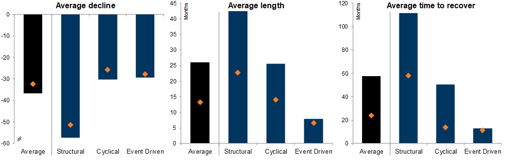
Exhibit 1: US Bear markets & Recoveries since the 1800s
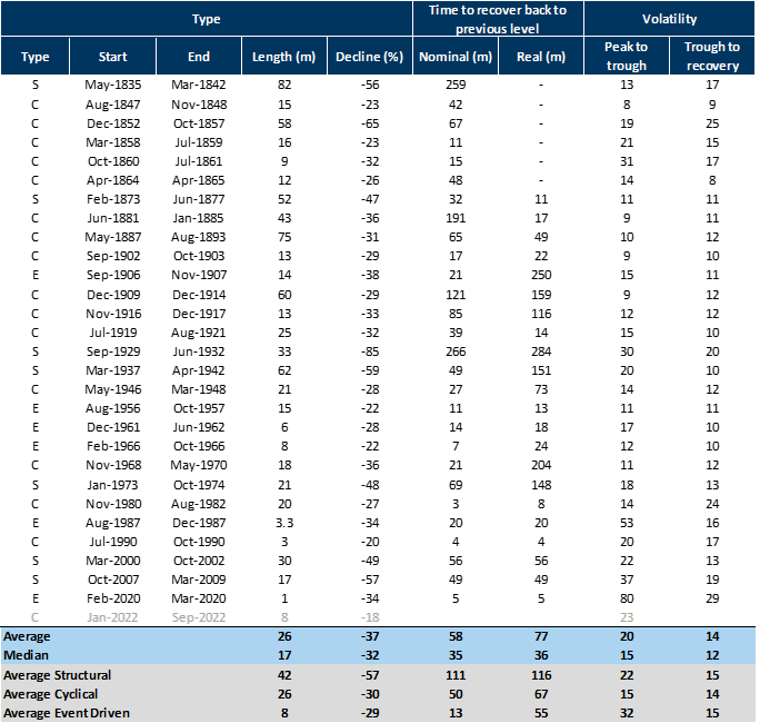
Exhibit 2: US bear markets & recoveries since the 1800s
How do you know if you are in a Cyclical or Structural downturn?
Excessive price appreciation & extreme valuations
New valuation approaches justified
Increased market concentration
Frantic speculation and investor flows
Easy credit, low rates & rising leverage
Booming corporate activity
New Era narrative and technology innovations
Late-cycle economic boom
The emergence of accounting scandals and irregularities
Exhibit 3: Characteristics common pre and post the different kinds of bear markets
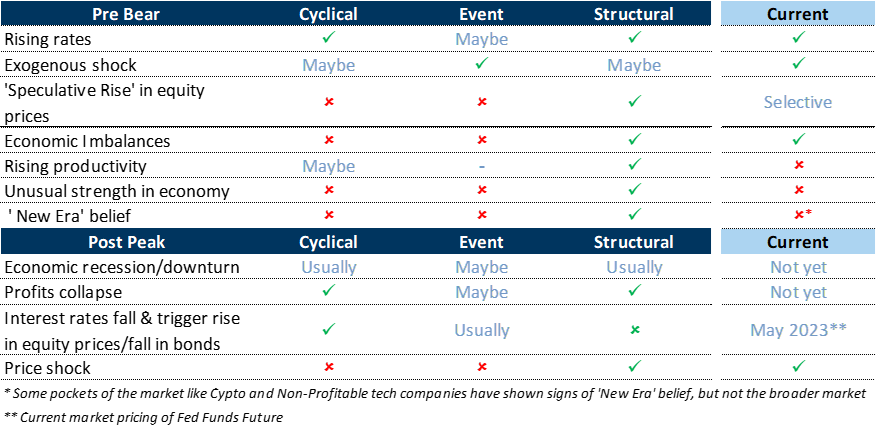
Exhibit 4: Equity markets outside of the US were expensive but not excessive in terms of valuations when the bear market hit
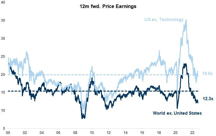
Exhibit 5: High savings rate across regions provides a buffer
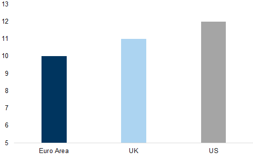
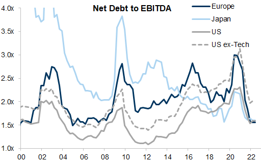
Exhibit 6: Net debt to EBITDA has decreased
Differentiating between a Bear bounce & a new Bull market
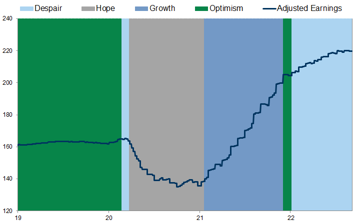
Exhibit 7: The relationship between earnings growth and price performance changes systematically over the cycle
Bear market rallies are common
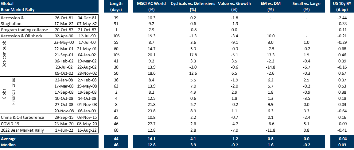
Exhibit 8: Historical examples of bear market rallies
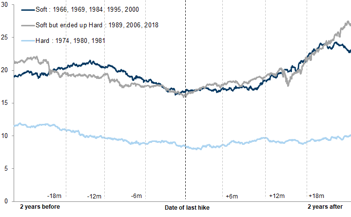
The Difference between Hard & Soft Landings
Cyclical bear markets around 'soft landings' are likely to end around the perceived peak in the policy cycle.
Cyclical bear markets associated with 'hard landings' are not likely to be resolved by interest rates alone. A peak in the policy cycle is an important part of the recovery puzzle, but a slowing in the second derivative of growth, together with depressed valuations, also tends to be important.
Exhibit 9: Soft Landings Are More Common Outside the US
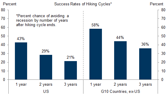
Exhibit 10: Soft Landings in G10 Countries Have Been Less Common When Inflation Is Very High
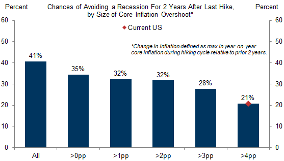
Exhibit 11: Profile of S&P 500 performance around historical soft landings
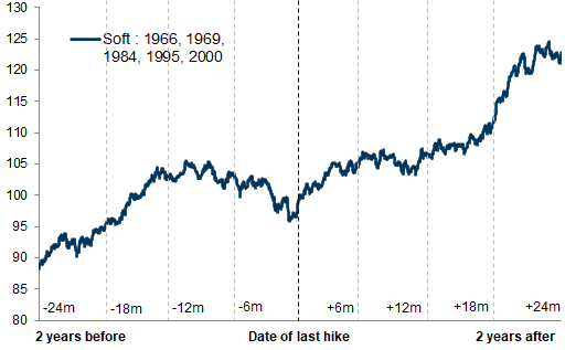
Exhibit 12: Profile of S&P 500 performance around historical hard landings
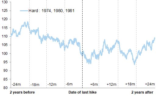
Exhibit 13: Profile of S&P 500 performance around historical landings
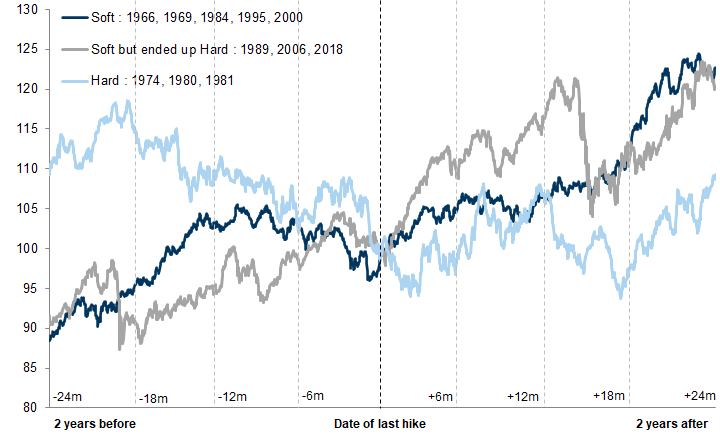
Exhibit 14: Markets tend to de-rate in both soft and hard landing scenarios
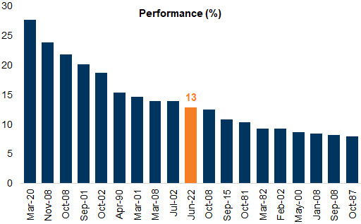
Why have we experienced a bear market rally and not a bull market inflection?
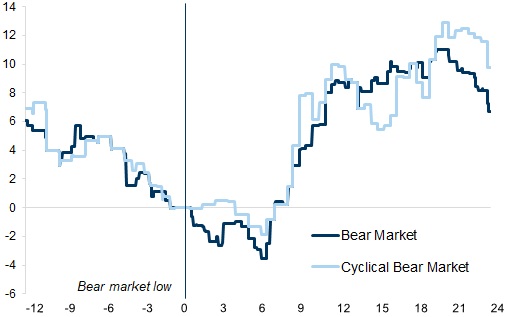
Exhibit 15: Duration of Bear Market Rallies
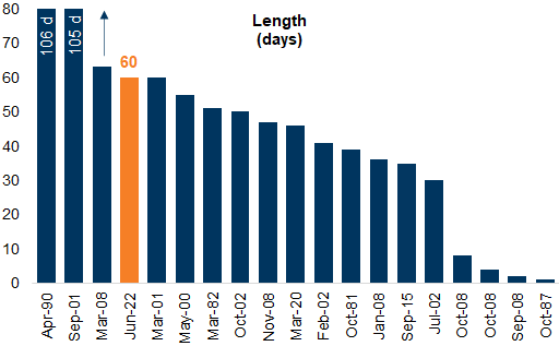
Exhibit 16: Performance of Bear Market Rallies
Supply as the problem, not demand
Identifying the transition from Bear Market to Bull Market
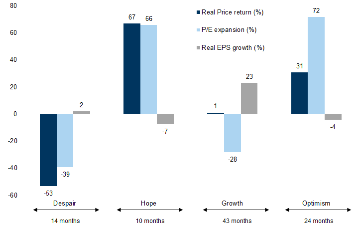
Exhibit 17: While the returns on average are fairly evenly distributed across the 3 phases of the bull market...
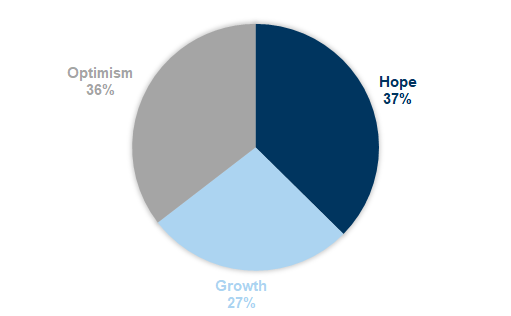
Exhibit 18: ...The length of these periods varies
Cheap valuations
A bottoming in the rate of deterioration in economic activity
A sense that interest rates and inflation are peaking
Negative positioning
1. Valuations & the market inflection
Exhibit 19: Valuations below the 30th percentile of historical averages are associated with positive returns
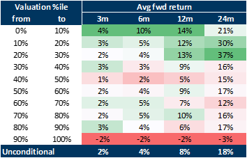
Exhibit 20: Global equities do not yet look cheap
Current assessment: We are not yet at levels consistent with a market trough.
2. Growth & the market inflection
Exhibit 21: The equity market has begun to price a recession on average 7 months prior to the official start of the recession
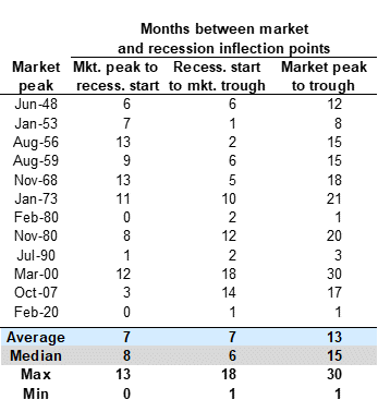
Exhibit 22: Weakest returns are when the economy slows from peak towards contraction
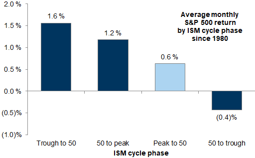
Exhibit 23: Most bear markets trough around 9 months before a recovery in corporate earnings per share
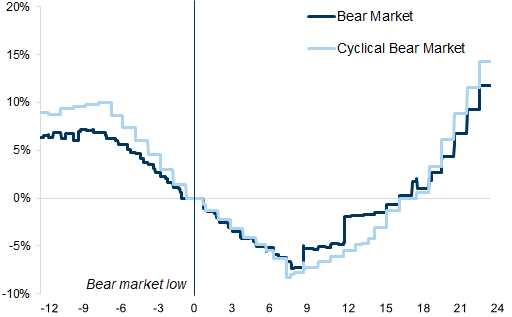
Exhibit 24: Most bear markets trough roughly 3-6 months before any trough in growth momentum
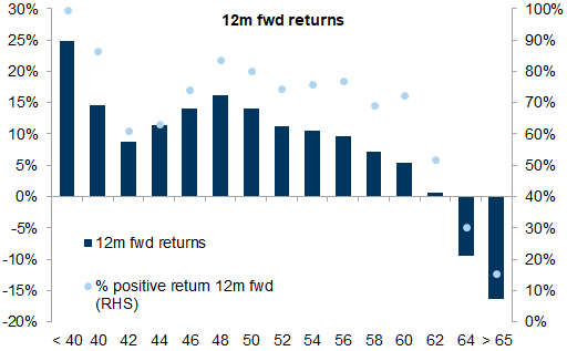
ISM <40 – strong BUY signal, you are at or very close to a trough
42-44 – DON’T BUY, we have gone below the point of no return and are now heading for recession
46-48 – provided the downturn is mild, this can be an excellent entry point, especially over 6 and 12m - BUY
50-54 – this is more or less ‘normal’ and generally ‘normal’ has been good for US equities – BUY
58 or above – SELL, the rate of growth is very likely to slow.
Exhibit 25: Significant weakness is typically followed by strong returns...
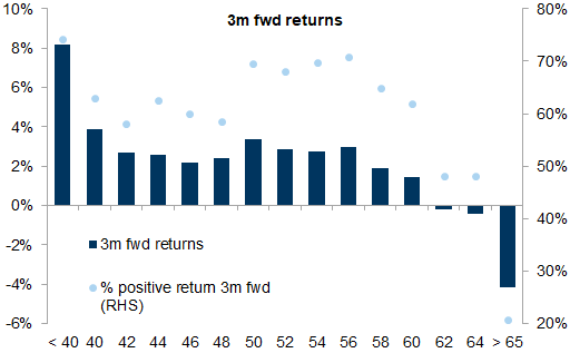
Exhibit 26: ...and significant strength by weak returns
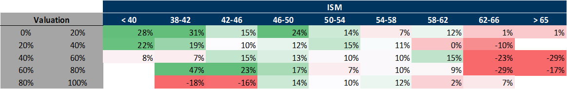
Combining Growth and Valuation as a signal
Exhibit 27: Over a six-month period valuations below average and ISM below 50 generally give a reasonably good signal
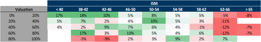
Exhibit 28: When valuations are below the 50th percentile and the ISM is contracting (below 46), forward returns tend to be strong
Current assessment: We are not yet at levels consistent with a market trough.
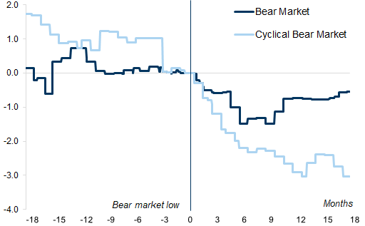
3. Inflation, interest rates & the market inflection
Exhibit 29: An easing of inflationary concerns and interest rates also typically tends to help the healing process
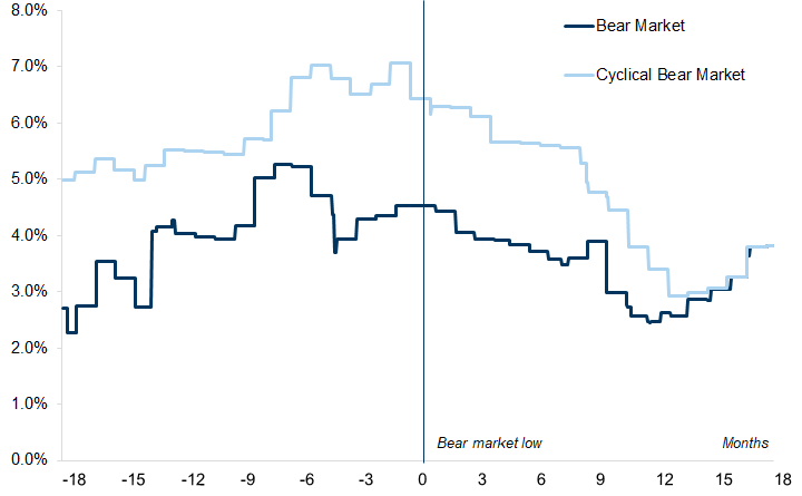
Exhibit 30: S&P 500 performance and ISM moves around previous peaks in headline US CPI inflation
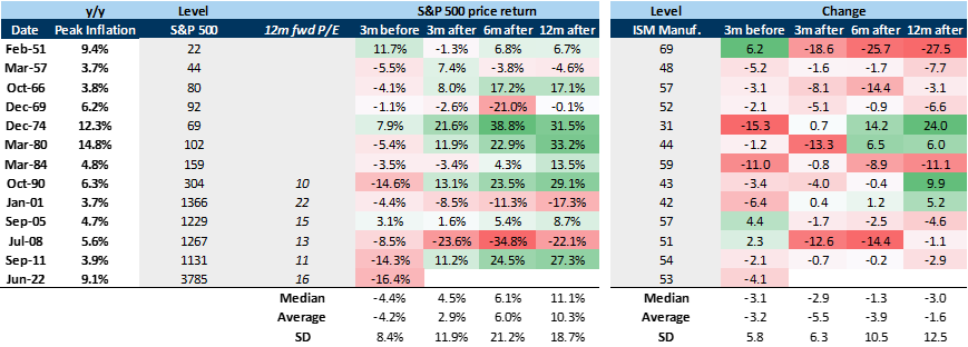
Exhibit 31: On average the market starts to recover just before 2-year rates start to fall...
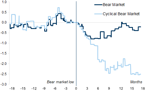
Exhibit 32: ...and typically not until the fed funds rate has peaked
Combining Growth and Interest rates
Exhibit 33: Accelerating real GDP is associated with positive returns irrespective of the direction in real rates, while decelerating growth coupled with rising real rates is by far the worst scenario
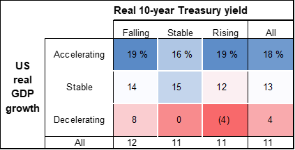
Current assessment: We are not yet at levels consistent with a market trough.
4. Investor positioning & the market inflection
Exhibit 34: Troughs in our indicator have historically coincided with equity troughs
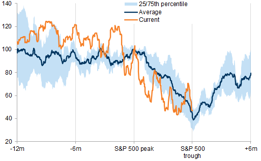
Exhibit 35: Prolonged bear markets can see sharp reversals in positioning before a sustained rebound
Current assessment: We are not yet at levels consistent with a market trough.
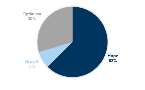
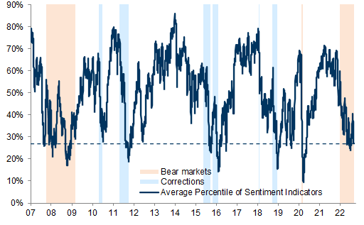
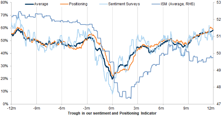
Exhibit 36: Sentiment surveys tend to peak only slightly earlier vs. other positioning indicators, but rebound much faster
Aggregate indicators to guide investors at inflection points
Our fundamentals indicator, GSBLBR
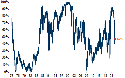
Exhibit 37: Our GS Bull/Bear Market Indicator remains elevated
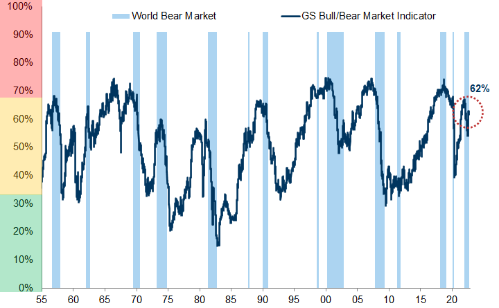
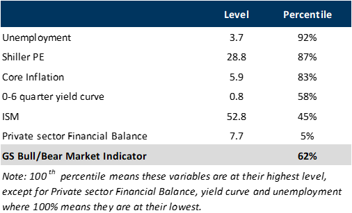
Exhibit 38: The percentiles of the components remain stretched
Our Risk Appetite Indicator (GSRAII)
Equities (all for MSCI World): ERP, EM vs. DM, Cyclicals vs. Defensives, Small vs. Large, Financials vs. Staples, S&P 500 vs. low volatility stocks.
Equity volatility: VIX, VSTOXX, CBOE skew, CBOE put/call ratio (1-month average), EUREX put/call ratio (1-month average).
Credit: USD HY vs. IG spread, EUR HY vs. IG spread, EUR IG spread, USD IG spread, Spain and Italy sovereign spreads, EM USD credit spreads.
Bonds: Germany 10- and 30-year, US 10- and 30-year.
FX: JPY/AUD, CHF/GBP, EUR/USD, Gold and USD trade-weighted.
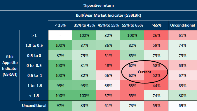
Combining our Bull/Bear Market Indicator with our Risk Appetite Indicator
Current assessment: We are not yet at levels consistent with a market trough. It is likely that the market will price a worse combination of growth and interest rates before a sustained trough in equity markets can be established.
Exhibit 39: Risk Appetite Indicator level and momentum factors
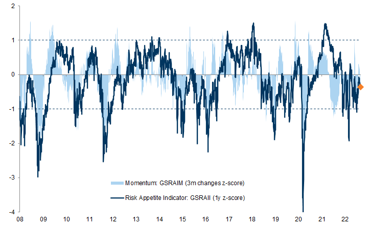
Exhibit 40: When the fundamentals-based indicator is above 65%, the average 12-month forward return is typically negative, irrespective of sentiment and positioning
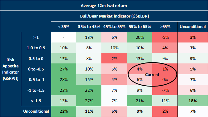
Exhibit 41: When the fundamentals-basaed indicator is below 45% AND the sentiment-based indicator is below 1.5, the probability of achieving high returns over 12 months is high
The Post-Modern Cycle and the Leaders of the Next Bull Market
Lower aggregate returns; a Fat & Flat rather than secular bull market
More focus on Alpha than Beta
A greater reward for diversification and buying at attractive valuations
Increased investment to increase corporate efficiency
Lower Returns; Fat & Flat
Exhibit 42: 10-year rolling real returns in US equities bought between 1982 and 1992 annualised at around 15%
Exhibit 43: Lowflation tends to be supportive of higher valuations
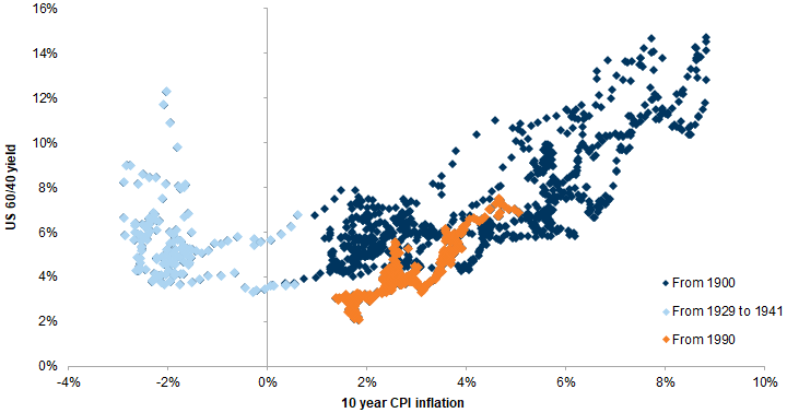
Exhibit 44: Inflation risk premia fell, as did nominal term premia
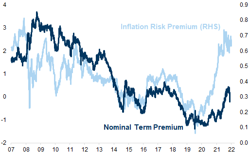
Exhibit 45: Proportion of negative-yielding global bonds
More Alpha than Beta
Exhibit 46: The secular underperformance of Value vs. Growth is starting to shift
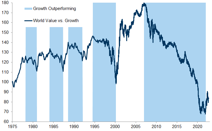
The secular decline in bond yields and inflation expectations has boosted the value of longer-duration Growth companies (while hitting Value companies most at risk of deflation).
A secular decline in long-term growth expectations, together with greater uncertainty about growth.
The bifurcation of industry returns, with impressive growth in the returns of the Technology sector and, at the same time, a secular decline in returns in sectors such as Banks and Energy.
Specific headwinds facing many value industries. For example, banks needed to de-lever and face tougher capital requirements and regulation, while commodity-related stocks suffered from falling commodity prices.
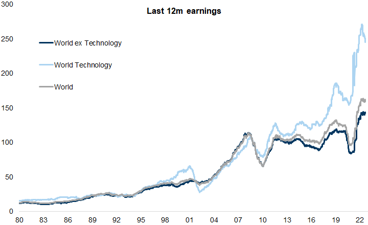
Exhibit 47: In the post financial crisis cycle the Technology industry had remarkable success in driving higher ROE and EPS
Diversification
Exhibit 48: Since the COVID-19 crisis a US 60/40 portfolio has delivered strong annualised returns
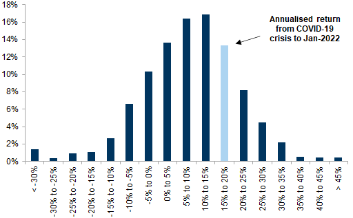
Exhibit 49: Despite the COVID-19 crisis the annualised 60/40 returns since the GFC remain in the top quartile
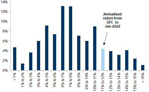
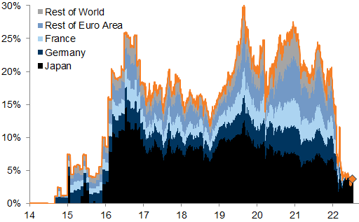
Exhibit 50: United States outperformance versus rest of the world
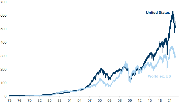
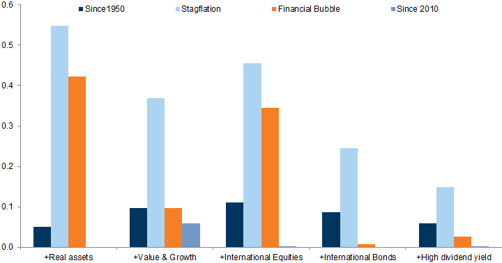
Exhibit 51: During 60/40 'lost decades' our 5 strategies would have materially enhanced Sharpe ratios
Greater Efficiency
Exhibit 52: The aggregate spend on gross fixed capital has declined just as spending on ICT has increased
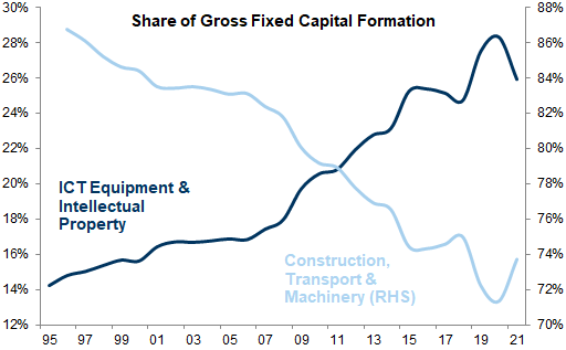
Exhibit 53: Deflation in technology costs and inflation in capital costs
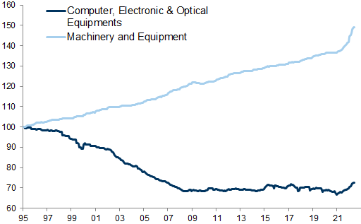
Exhibit 54: Recent surveys show a significant increase in corporate fears over higher costs
Appendix
Exhibit 55: 12m fwd Price/Earnings across phases
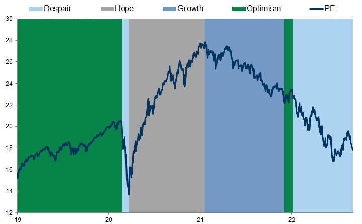
Exhibit 56: Price return across phases
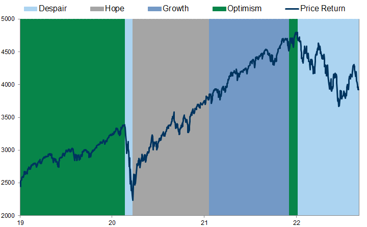
Exhibit 57: 12m trailing EPS across phases
Investors should consider this report as only a single factor in making their investment decision. For Reg AC certification and other important disclosures, see the Disclosure Appendix, or go to www.gs.com/research/hedge.html.